The ‘Hrishipara daily financial diary’ research project has been collecting data from 60 low-income respondents living near a market town in central Bangladesh since May 2015, and is ongoing. Field staff visit our ‘diarists’ daily1 to record the money that flowed into and out of their hands that day, noting the value and purpose of each transaction. These data allow us to measure poverty in various ways and in this paper we discuss the results of five different measurements.
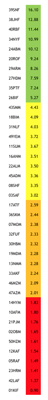
Chart one: diarists ranked by income: PPP $ per person per day
Measurement 1: using income per person per day averaged over time
In our blogs and reports published so far, we have relied on average daily income per person in the household to categorize our diarists according to internationally-recognized benchmarks such as the ‘extreme poor’ line of around US$1.90 of income per person per day (in ‘purchasing power parity’ terms2), or simply by dividing our sample into income quartiles.
We total all income ever received during the time we have been tracking each diarist and subtract any business costs. For example, for shopkeepers we consider business income as the value of all sales less the value of all stock purchases and of running costs such as rent and power. This total includes gifts received, but excludes financial inflows, since loans and savings withdrawals are not income, but merely ways of moving money through time. We then divide this total by the number of days that we have tracked the diarist. Finally, we divide again by the number of people who depend on that income (usually, the number of people in the household) adjusting for the fact that this number may have varied over time. Of our 60 diarists we have 40 whom we have tracked for at least 20 months. Chart one shows their average daily incomes, ranked into four quartiles, the lowest of which are within the conventional ‘extreme poverty’ category, with those in the top quartile perhaps better described as ‘near poor’.
The high level of accuracy of our data, an outcome of our daily contact with each diarist, and the long period over which data are collected, make this a good way to measure income3. It is better than single-interview surveys that depend on the respondents’ uncertain ability to recall transactions. Another problem with typical surveys is that business expenditures might be lumpy, and take a long time to produce income, so that income is under-reported: the longer time-period of our data helps with this problem, although it doesn’t eliminate it altogether.
Our results are still subject to accidents of timing. Our team was surprised that diarist 08SHF appears in the second quartile, because her lifestyle is more like diarists in the lowest quartile. 08SHF got a sudden flurry of gifts when, within a few days, her husband died and her daughter had her first baby. Had we tracked her over a different time-period we may not have captured this ‘outlier’ data, and 08SHF’s daily income average would have been lower.
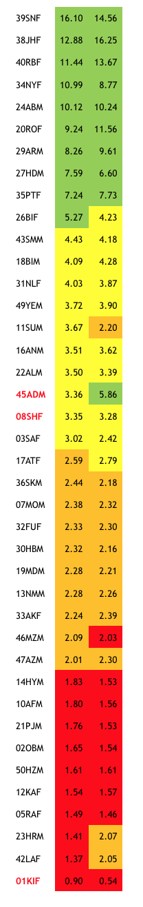
Chart two: diarists by income (left) and consumption (right): PPP $ per person / day
Measurement 2: using consumption per person per day averaged over time
What households consume is often the preferred indicator for poverty measurement. Our long-term daily data are equally strong on income and consumption, enabling us to compare between income and consumption-based measures.
We make our consumption-based table in much the same way as the income-based one. We take all expenditure outflows other than the costs of business but including gifts given and transfers to others in the household. We exclude financial outflows. The total is then divided by the number of days tracked and by the number of dependents.
Chart two reproduces the results from Chart one, but adds a column of data for average consumption per day. Colour-coding by quartile helps reveal the differences between the two measurements
Not much changes. The allocation into quartiles doesn’t change much whether we measure them by income or by consumption. Moreover, if we add up all the per-person per-day figures in the income column they come to PPP$ 174 (on average, the daily per-person incomes of these 40 diarist households total to $174). The total for the consumption column comes to PPP$ 179. Again, very little change.
What explains the few differences? Partly it is the timing issue again. 08SHF remains in the second quartile, because her sudden influx of income resulted in an equally sudden flurry of consumption4. But diarist 45ADM, who was in the second income quartile, appears in the top consumption quartile. 45ADM is a migrant worker from a distant district. Shortly after we started tracking him, he took a large sum that he had previously saved and sent it to his father to be spent on bringing up ADM’s brothers and sisters still in the village5. The size of this sum ‘skewed’ the average upwards.
The remaining differences are due to habits of thrift. Diarist 01KIF is so poor she sits at the bottom of both tables. Her daily income averages $0.90, but her daily consumption a measly $0.54. This is because she tries to save every penny she can for the future of her only daughter, and on average 36 cents goes each day into a savings account at a local co-operative – outflows which are financial, rather than consumption. See a later section of this paper for a view on whether there might, after all, be some merit in including financial flows in income and consumption analyses.
Note that whereas financial flows affect consumption levels (as people save rather than spend, for example) they don’t affect income levels: income remains the same no matter how much is borrowed or repaid or saved or withdrawn. Perhaps this feature makes income-based measures ‘better’, or at least more stable, than consumption-based ones, especially if by ‘poverty’ we mean a lack of purchasing power rather than a low level of consumption.
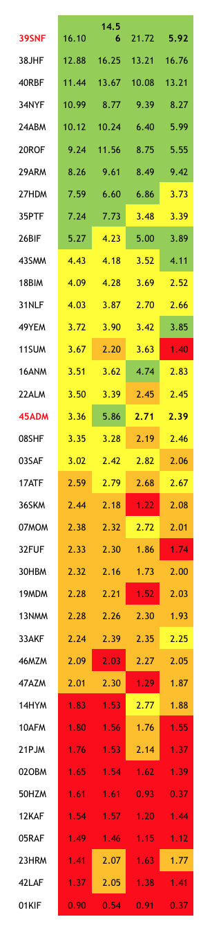
Chart three: diarists ranked by average daily income (col 1 & 2); showing also average daily consumption (col 3); median monthly income (col 4); and median monthly consumption (col 5)
Measurements 3 and 4: using monthly median values for income and consumption
Diarists 08SHF and 45ADM alert us to the effects of ‘outliers’ – unusually large or unusually small amounts spent or consumed which affect the daily average values in ways which may not be useful. 45ADM’s massive once-off spending on his siblings raises his average spending in ways that may not help us understand his situation: for example, it puts his daily consumption ($5.86) out of balance with his daily income ($3.36).
One way to deal with such problems is to ignore some of the unusually large transactions (or ‘outliers’), but that raises difficult questions about the criteria that should be used for such exclusions.
Another way to soften the effect of outliers is to use medians rather than means6. We therefore calculated the income and consumption totals for each diarist for each month, and then took the median month. The reasoning is that we might be more interested in what a ‘typical’ (and actual) month looks like than in knowing what an arithmetically-strict but actually-non-existent ‘average’ month looks like.
The results are shown in chart three. Again, a good number of diarists remain in the same quartiles whichever measure is used. Nobody shifts by more than one quartile. But there are changes. For example, our 45ADM puzzle is resolved: his consumption drops back to the second quartile when the influence of his one big expenditure is reduced.
Our 08SHF puzzle is also partly resolved. Her income, measured by medians, drops down a quartile, as the effect of her sudden deluge of gifts is softened. But her case reveals another difference between the daily mean and the monthly median results – values drop for many diarists. In 08SHF’s case the falls are sharp: per-day income falls from $3.35 using daily means to $2.19 using monthly medians, and her consumption from $3.28 to $2.46. Because these lower figures are much more like what we would have guessed by observing her way of life, our team might like to claim that the median-based figures are ‘better’.
But we need to be cautious. Median values are very sensitive to the time-frame we choose. Imagine a diarist with a regular monthly salary (we have a couple). Because she gets income only once in 30 days her median daily or median weekly income would be close to zero, a seriously misleading outcome. Only her median monthly income would reliably indicate her real situation. That’s why we chose monthly medians in our analysis. But even so this may result in inaccuracies for diarists with ‘lumpy’ incomes, like a farmer who gets much of his income in large amounts at seasonal intervals. Despite their distortions, calculations using mean values avoid this arithmetical trap.
Diarist 39SNF’s case is also instructive. She sits right at the top of both income tables (columns 2 and 4 in chart three). But she is another of our ‘puzzling’ diarists, since her lifestyle is unlike other first-quartile diarists and more like people in the third quartile. The explanation is that she gets big remittances from her son in Malaysia (so her total income is large) and they come almost every month (giving her a high median monthly income). Her main use of the remittance money is to get her second son to join his brother in Malaysia, and she pays several very large amounts to brokers who offer to facilitate this. As a result, her total consumption is large, and she sits at second-from-top in the table when consumption is measured using means (chart three, column 3). But these payments to the brokers are neither frequent nor regular, so her median monthly consumption (column 4) is low – four times smaller than when measured by daily means. SNF stores the remittances from her son in an MFI – might a check on her financial flows help clarify her case?
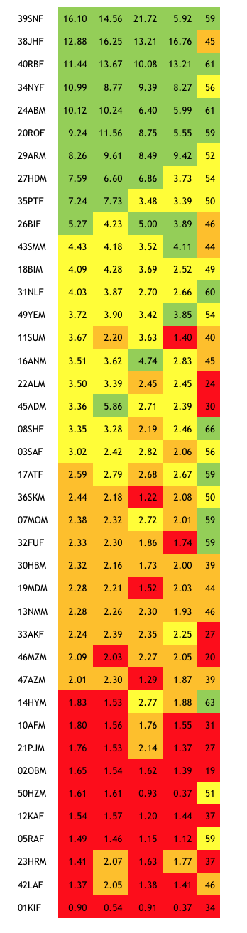
Chart four: as Chart 3 with a column of PPI survey scores added (extreme right)
Why not include financial flows?
Loans taken and savings withdrawn are financial inflows, not income; and loan repayments and saving deposits are not consumption. Analyses of poverty levels usually ignore financial flows. But saving and borrowing behaviour critically influences the results for consumption, since diarists who save a lot and don’t borrow (nor withdraw their savings) tend to have consumption levels that are lower than their income levels (or higher if they borrow a lot and don’t save or repay much). So why not run an exercise that includes financial flows?
39SNF’s case shows what would happen if we did. When remittance money arrives from Malaysia she puts it into savings accounts at Grameen Bank, and then withdraws it to pay the broker. Moreover, she often moves her money around between accounts at Grameen, as passbook deposits grow large and are withdrawn and re-deposited into fixed deposits (CDs). Her financial transactions are therefore very large indeed, and including them in income and consumption totals would overwhelm her ‘ordinary’ income and consumption levels, making them meaningless.
With SNF’s case we arrive at a question we have side-stepped so far: when we speak of poverty, are we interested principally in income and consumption or in wealth? SNF is undoubtedly wealthy. She has big bank balances and she now has two sons in Malaysia whose remittances will ensure that those bank balances grow. In her mind, though, that wealth is not her own – it belongs to her sons, and she spends almost none of it on herself. She lives in a very modest way in her old-fashioned mud home, eating little and consuming almost nothing else.
Measurement 5: using PPI ‘Poverty Probability Index’ survey values
For our final measurement, we turn away from our daily data to data from surveys that we do from time to time among our diarists. PPI surveys use a small number of easily-collected measurements of households to determine the likelihood of their falling within ranges of poverty, such as the range below Bangladesh’s official ‘lower poverty line’ (around 62 taka, or PPP$1.95 a day). We ran the survey for the forty diarists featured in this paper, and added a further column to our table to show the results7.
The colour coding shows that the ‘fit’ with our original measurement – daily average incomes – is less good for PPI scores than for the other alternatives, but still quite close at the lower end, especially among the lowest quartile. Many of the differences occur because the biggest factor influencing PPI scores is the number of children in the household under 12 years of age. Several of the diarists who are in the lower quartiles by income or consumption are middle-aged women whose children have left home and who therefore emerge higher up in the PPI rankings. Some though, like 01KIF and 12KAF, are so poor that they appear in the lowest quartile under all five forms of measurement. Given that PPI surveys are often used by organisations such as microfinance providers and NGOs to target households most in need, Chart five can be read as an endorsement of its accuracy.
Some conclusions
- Totalling income data over a known period (as in chart one) looks like the best bet if we are interested in understanding purchasing power (irrespective of whether some of that power is used to make savings or repay debt). It would be better to express the results as income per month, or per year, since expressing it ‘per day’ risks implying that daily income flows are the same each day, which is almost never true8. Its only important drawback is that it can be distorted by ‘outliers’ in the data, as we see for several of our diarists.
- Totalling consumption data over a known period (as in chart two column 3) results in rankings similar to those produced by totalling income data, and if it covers a big enough number of individuals the aggregated absolute amounts involved will also be similar. But it is sensitive to financial flows, and it is not easy to control for these. This makes it less appealing than totalling income data if we are looking for generalisable indices of the “dollar-a-day” kind.
- Calculating income and/or consumption medians for a series of periods, such as a month (as in chart three columns 4 and 5), is good if we are interested in seeing what a typical (and actual) month’s income and consumption look like (as opposed to an arithmetically-precise but actually-non-existent month). Its drawback is that it is very sensitive to the period chosen (week, month, season etc), making it more applicable to studies of a small number of known cases.
- Including financial flows when calculating income and consumption (whether we are using means or medians) is not helpful in measuring poverty levels.
- The PPI index rests on easily measurable observations of domestic assets and household composition and behaviour such as school attendance. Applied to our sample of diarists, it results in rankings that are not too distant from our other measurements.
Stuart Rutherford
November 2017
- Seven days a week, in the evening of the same day, or occasionally the next morning: if they are out-of-town we phone.
- One US dollar converted into taka at the market-exchange rate (now around 82 taka to the dollar) buys much more in Bangladesh than a dollar does in the USA. So we convert values using the World Bank PPP rate of 31.9 taka to the dollar.
- But expensive, of course. We are not advocating that all poverty measurement should use daily diaries!
- Her case is discussed in a previous blog When Poor People Spend Big, Part 2
- If, in such cases, money is regularly sent back to the village to be spent on siblings, we count those siblings as dependent members of the diarist’s household. We have 3 or 4 such cases.
- Means and medians are two different kinds of average. To find a mean we add up a string of values and divide by the number of values in the string (the mean of 3, 5 and 12 is 6.67): a median is the value indicated by the middle number in a string of numbers (the median of 3, 5 and 12 is 5).
- The numbers shown in the PPI column are the scores recorded in the PPI survey: to understand their significance please refer to the PPI website.
- The book Portfolios of the Poor discusses this objection to the “two dollars a day” meme.
![]() The Hrishipara Financial Diaries Project is currently being funded by the UNCDF SHIFT Programme based in Dhaka Bangladesh, and we are grateful for their support.
The Hrishipara Financial Diaries Project is currently being funded by the UNCDF SHIFT Programme based in Dhaka Bangladesh, and we are grateful for their support.
Read more analysis based on the Hrishipara Diaries:
- How are Digital Financial Services used by poor people in Bangladesh?
- What the poor spend on health care?
- How the poor borrow?
- What do poor households spend their money on?
- Tracking the savings of poor households
- When poor households spend big
- When poor households spend big part 2